What a design system is and why it matters

If you’ve been in or around digital and creative agencies lately, you may have noticed the term “design system” being thrown around more and more frequently. That’s not because agencies have grown tired of older buzzwords like “growth hacking” and “snackable content.” It’s because we’ve found a truly useful new way of working better, smarter and faster.
When a team from Emakina gets to work building a new website or app for a client, they create the best possible product in the most efficient, cost-effective way. For bigger projects, this is now often done using something called a design system.
A design system is a single toolkit an entire team can use to design a product together.
Isn’t that just a long way of saying it’s a style guide?
You might think a design system is just a fancy way of renaming a style guide or library of brand assets – and you would be partially right. That’s one element of it. A comprehensive design system is so much more, though. It’s a complete toolkit that comes with all the instructions on how to use each tool properly.
Marc Dalemans, a senior designer at Emakina who specialises in building design systems, says it’s still a relatively new idea. Even industry colleagues are still having trouble distinguishing design systems from old-fashioned style guides.
“We have now shifted our focus. We don’t just sell our clients an asset library. We sell them a system of design. That’s much more effective.”
Marc Dalemans, senior designer at Emakina.BE
What a design system IS NOT
- A brand asset dumping site;
- A set of static brand guidelines carved in stone;
- A piece of software like Photoshop or Illustrator.
What a design system IS
- A live library of components and their building blocks and patterns;
- A live set of standards for using them;
- A hub for learning and sharing.
Once everyone on the team is on board with the brand’s values, goals, and how they would like them presented, they can get to work. They start by crafting the smallest parts that make up the website or app until they are very refined, then they assemble the site using these standardised smaller parts.
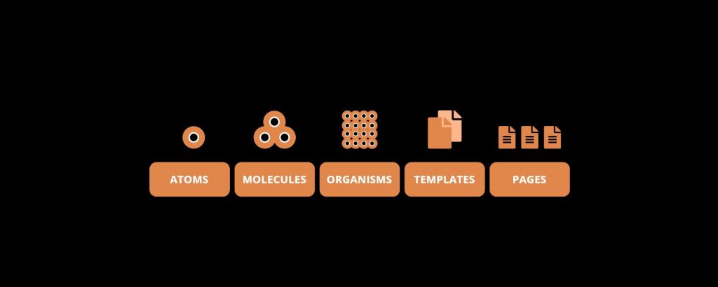
Marc Dalemans references a book by designer Brad Frost, titled Atomic Design, to explain this logic. Frost refers to the building blocks of a design system as the atoms, molecules and organisms that become the templates and pages of a site.
Frost’s system for organising the building blocks of a design system looks like this:

True to Frost’s scientific metaphor, the design system acts very much like a living organism. It adapts over time and reacts instantly to change.
When an atom gets changed, the entire system is affected.
For example, if a designer feels a certain component on an app is outdated or functioning poorly, they can change the atoms that make up that component at any time. Once they do this, every other component that is built using that atom will be affected.
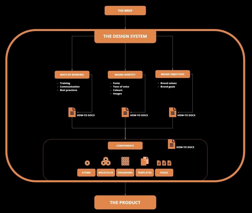
Now, zooming out a bit, we can start to organise an entire design system this way:

When it all comes together, what’s the result?
Building and using these standardised tools, our team creates websites and apps that simply make more sense.
The smallest building blocks are crafted with the utmost care so that the entire design can fit together tightly.
Once this system of organisation is in place, the designers can focus on what they do best – being creative. When asked in fine detail about Frost’s scientific way, Dalemans objects, saying: “It’s a bit too sciencey for me.” Like many other designers, he is fully fluent in the logic Frost outlines, but prefers to keep the designer’s real goal top of mind.
“Our first mission is to create a design system that truthfully reflects the identity of the brand.”
Marc Dalemans, senior designer at Emakina.BE
He then quickly points to a more arty source for another explanation of this objective design principle – 20th century French painter and graphic designer Cassandre. Marc says one of his famous quotes about poster design can easily be applied to design systems.
“The poster [ie: design system] is a shortcut between trade and the prospective buyer. The poster artist [ie: design system] does not issue a message, it merely passes it on. It is only expected to establish a connection — clear, powerful, accurate.”
Cassandre, Adolphe Jean-Marie Mouron
So, what’s in it for me?
For big projects, a comprehensive design system benefits everyone involved. As the User Agency, we think of our clients’ end users first. What they get is:
- A website or app that is super easy to use;
- Something that looks great and wins their trust;
- And a platform they’ll happily use to shop or get info from.
These are all the results of a few major improvements a design system brings to our team’s workflow:
- Quality design and development work can be reused and scaled up;
- Visual consistency is ensured throughout every channel;
- Repetitive tasks are minimised so our experts can solve complex problems;
- New team members can use it as a tool to get up to speed quickly;
- Communication is centralised so team members are all in sync.
So, where’s this science lab for designers?
Designers all have their preferences, but design systems are most often built using online tools like Figma, Sketch and Adobe XD. Each has its own strengths and weaknesses, and designers often use them in combination.
Figma themselves created this handy, but very subjective comparison tool showing the differences between Figma and Adobe XD, and Figma and Sketch. You will notice how clean and easy to use their own website is. They obviously have an impeccable design system themselves. Most pioneering companies now do.
5 great examples of brilliant design systems
- Apple’s Human Interface Guidelines
- Microsoft’s Fluid Design System
- Google’s Material Design System
- IBM’s Design Language
- Shopify’s Polaris
If you’re interested to see how a designer goes about building a design system, this video shows designer, front-end developer and YouTuber Jesse Showalter giving a quick overview.
The not-so final word on design systems
It’s all still relatively new with forums, talks and courses only recently popping up across the industry and the web. As Emakina designer Marc Dalemans says, the best practices are still being defined as we go.
That’s very much the heart of a design system – the idea that something can always be improved. What is certain, is the power a design system has to transform a business into a powerful design force capable of giving a brand’s users exactly what they want.


