Eco-friendly websites: how to avoid ‘greenwashing’

How to build a digital experience with accessibility and ecological processes in mind – without falling in the trap of ‘greenwashing’.
Eco-design is not just a discipline for architects and builders. These days, we often get requests for CO2 neutral, eco-friendly and/or accessible websites. Can we build them? What are the best practice rules? The internet is responsible for 2% of greenhouse gas emissions (roughly the same as the aviation industry!), so these are valid concerns.
As the User Agency, what we create and how we build it is a responsibility we take very seriously. We believe that if you’re empathetic in what you do, you’ll create high performance digital experiences that everyone enjoys.
Usability should be your goal from day one
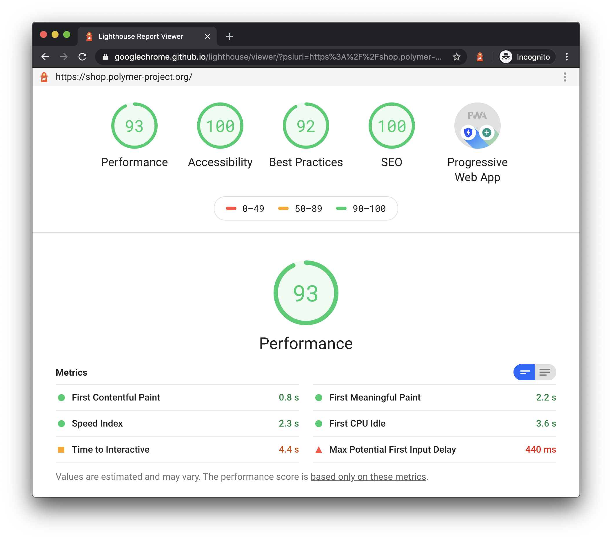
An obsession with usability is embedded in our culture and way of working. We have a task force of designers, testers, developers and project managers trained to ensure accessibility from day one. Over the years, we’ve learnt from clients who requested us to respect accessibility basics and we also work with best practice guidelines from the likes of Lighthouse.
Say, for example, a new client wants us to design a CO2 neutral website. Firstly, if you want to be completely carbon neutral, you won’t have a website in the first place and that would be brand suicide. Instead, we work with clients to find a golden middle ground: a UX strategy that combines outstanding user experience and performance, fits into wider sustainability goals and follows the latest accessibility guidelines.

We focus on eco-conception, then eco-production
Let’s compare building a website to building an energy-efficient house. These days, architects design the most space-efficient houses, with only the rooms you need, and being economical with electricity, light fittings, heating/cooling, etc.
It’s the same with a website.
You start by defining the function – what are the must-haves and what non-essentials can we get rid of? The more we focus on the need right from the prototyping stage and design specifications, the bigger the reduction on the environmental impact can be. We ask questions like: what is the environmental impact of the user journey? Do you really need an e-commerce site if you can sell through a marketplace? Are users asking for an app or are you just following a trend? Focus on your users’ values and what they really need.
Next, we look a simple design: choosing responsive design, using icons where possible and limiting the number of fonts you use. Optimising your site by cutting unnecessary plug-ins – they burden the code of the website, slowing it down. Choosing light content (not too many images, video, animation) and using minimised source code. We’ll set a ‘page weight budget’ and question all our design habits. We’ll plan our sprints in line with a client’s sustainability objectives.
What we’ve just described is an eco-friendly designed website. How you do this is the process of eco-conception – a way of how things are created following the principles of sustainable development. It’s simple: a well-designed website will have great performance and therefore a reduced impact on the environment. Content will load faster and there will be less unnecessary downloads. It will be easier to modify over time and your SEO will be optimised.
Accessibility is essential for digital sustainability
As the User Agency, our digital platforms must be easy for all users to use – including ones with disabilities. This means having a logical page structure, adding keyboard shortcuts, designing forms for web accessibility and using intentional copy that helps the reader. Here are some accessibility must-haves:
- Improve your navigation and you can reduce the number of pages users need to load.
- Use minimal images and videos, and you don’t end up with ‘lazy loading’ (loading media that isn’t needed).
- Reduce image size and you use less data, saving energy.
- If you must have videos, don’t let them autoplay.
- Web caching allows users to download and store certain elements of your site, so it loads faster next time.
We hope that this process has opened your mind to what is possible in terms of eco-design and accessibility. An eco-friendly website not only uses less energy but will also appeal to customers and build your brand values.
Get the ball rolling
Together, we can work towards a greener and more accessible web. Emakina can run a sustainability audit of your current platforms, do user and UX research, and create a UX-friendly framework. Get in touch with our digital sustainability team today. If you want to find out more about accessibility, check out our two-part series here and here.


