From Talking Bottles to Graphic Cheese: Typography Sells
You’ve probably seen them before: those gin bottles with a hipster-handwritten font. Or chocolate bars with a design so pure that you can almost taste the cacao by simply glancing at it. Let’s face it: typographic branding is hot. And even more so: it SELLS!
Are you a child of generation Z? Then there is a big chance your parents are very devoted consumers. They’ve shopped at the same supermarket for decades, they always use the same detergents to wash their clothes and would never dream of changing hairdresser out of pure politeness. Being a customer in the digital age is something else though.
Gen Z consumers are not responding to traditional established brands anymore. On the contrary, they are constantly on the lookout for an authentic, human and more honest connection to the products they consume. A well-thought-out branding with customized logo and font helps them get familiar and – eventually – connected with a specific brand.
Big things come in… stylish packages
Actually, for a majority of brands it all comes down to standing out on the shelves. To meet this shift in consumer demands, they are rolling out packaging designs that are visually attractive and at the same time communicate simple and honest values.
One of the biggest current trends in packaging is typography that creates a more dynamic look on labels, boxes… And in this case, the sky is the limit! There are thousands of fonts, colors and styles out there. At Emakina, designer Aurore De Jamblinne emphasizes the importance of choosing a clear font that is well integrated in the design and represents the brands core identity.
Nicolas Dierck, concept designer at Emakina, believes in a smart branding strategy: “Choosing your packaging and typo should always be in line with the products you offer and, even more importantly, with the vision you set out for a brand. Not investing in your brand identity is simply not an option anymore. Nowadays consumers not only have a lot more buying power, their choice in products is also tremendous. You have to distinguish yourself as a brand or you’ll lose.”
Typography trends for 2015
Los Angeles-based The Dieline, a leading expert in the package design industry, defined four emerging packaging trends for 2015, all with their own typographic style.
Biobased: “we are moving towards more homemade and environmentally responsible products and packaging” says our designer Aurore. “Think of recycled paper, less plastic…”
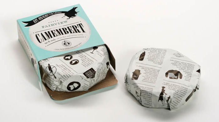
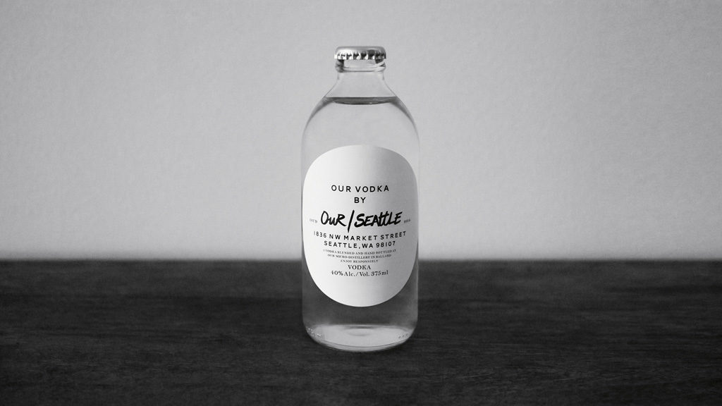
Visual Authenticity: with a strong emphasize on the craft, quality and skill in both the product and the packaging design. Features: handwritten, raw or sketchy fonts and a natural color palette.
Luxury of Less: no more over the top branding. The new code word is ‘subtle luxury’. Features: hand drawn icons, graphic elements and soft, understated colors.
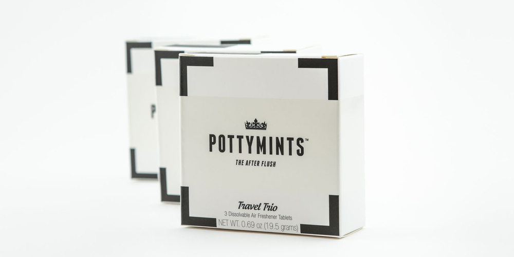
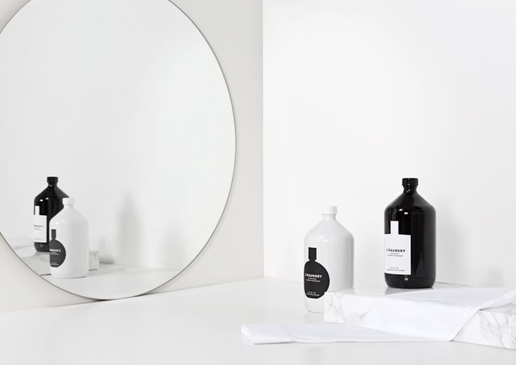
Ultra-Pure: a reaction to the growing consumer appreciation for minimally designed products. Features: monochromatic, minimal word marks, abstract geometric shapes.
So, if you want to put your brand out there and build a real connection with the new generation of consumers, keep in mind that typography will continue to play a big role in the way companies present their products to the world. Just think about that bottle of wine you bought just because the label seemed fancier than its price…

